Dessi brandbook
Logo, visual system, and the story behind a studio built for useful AI creation — not novelty alone.
Logo
A bold capital D for Dessi — rooted in drive, progress, and motion.
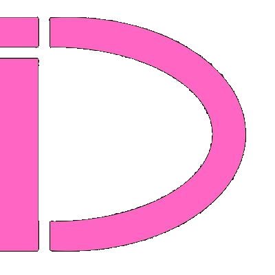 Primary on dark
On light surface
The mark is a stylized letter D that points to the brand name Dessi (with two S’s). Its conceptual root is drive — movement, progress, and the forward push that modern AI represents: new capability for everyone, regardless of local hardware.
The two S letters stand for speed and superior — foundations the founders set when they started the project: respond fast, ship quality, and keep raising the bar.
Visual styles
Core tokens used across dessi-ai.com — dark surfaces, pink accent, clear type.
Colors
#FF2D95
#E11D74 → #FF4DAD
#22D3EE
#2A2A30
#060607
#F4F4F8
Typography
DM Sans — display & UI
Body copy stays readable on dark surfaces. Use clear hierarchy: one strong headline, one short lead, then supporting detail.
JetBrains Mono — labels · tags · tokens
Buttons
Brand story
Started in 2025 — late enough to learn from first-wave tools, early enough to shape what comes next.
Dessi’s story began as a challenge: AI generation tools should not exist only for entertainment. They should help people ship useful content and solve real business tasks. That belief became the mission — help creators and teams generate more content that actually works, across many kinds of functions, from deepfake-aware workflows to AI companions that can ease loneliness and make the world a little happier.
Timing mattered. Launching in 2025 was relatively late compared with the earliest generation tools — and relatively early compared with the newest wave still arriving on the market. That middle ground let the team learn from what already existed while building for what people need now.
The team is five people today. Three are engineers with experience in artificial intelligence and machine learning. Offices span time zones from Hong Kong to California, so the project can respond quickly to issues, ship improvements, and keep the backlog moving with new features.
With Dessi, technical limits of a personal computer should not block imagination. The platform is built so anyone can create something new and inspiring — driven by progress, speed, and a superior bar for quality.
- Founded 2025
- Team 5 people (3 AI / ML engineers)
- Presence Hong Kong → California
- Name Drive · Speed · Superior
Try the studio
See the brand in product — generate, iterate, and export.